


If you've experienced poor sales, poor leads or general poor engagement with your website - you might have read that SEO is your biggest next step.
That said, 9 times out of 10 what you really need is a better design before you ever start to dive into SEO. This is especially prevalent among entrepreneurs who have designed their own website, those who have used an out of the box template, and those who have hired a freelancer to build a website on the cheap.
In face, we've had such an influx of requests from clients with the Web Design vs. SEO problem that it prompted this very blog post. So why and when should design be a priority over SEO and how do you know if you're putting the cart before the horse?
We'll be laying out 5 very basic changes for a client that we did a light website revamp for to show you exactly what you can look for to see if your website might be a victim of a design that puts prospective customers off rather than drawing them in. Because at the end of the day, your site needs to make you money and we're here to help make sure you're achieving that goal.
Overall Website Look & Feel
One of the biggest mistakes I've seen with website design is that information comes first and design comes second. When that happens, we've found that although the site has very great information for the potential customer to read, it's either hard to read, isn't organized well, or visually overloads the user.
Any well-versed web designer not only takes into account the usability of your site from a design perspective, but also from a sales and marketing perspective. Because at the end of the day, just because a website is up and live doesn't mean it's going to sell anything and convey the trust in your brand that you're hoping will convert the prospective buyer into a new client or customer.
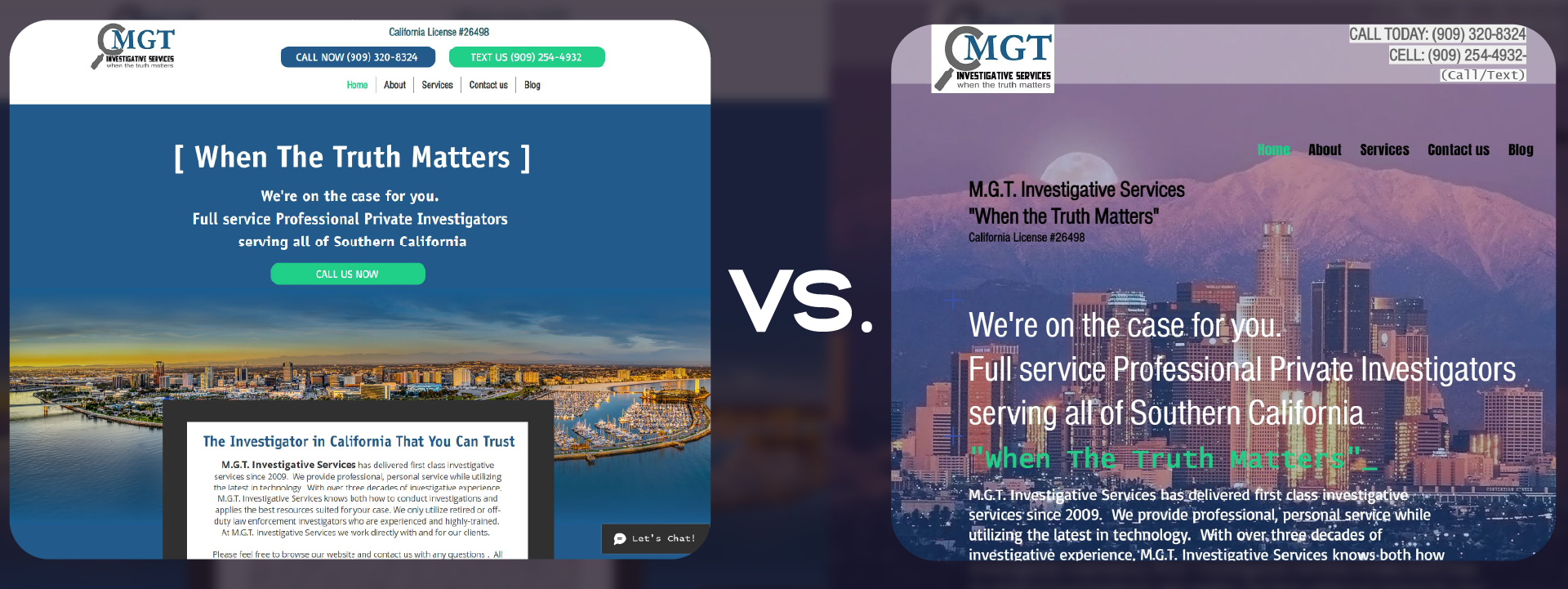
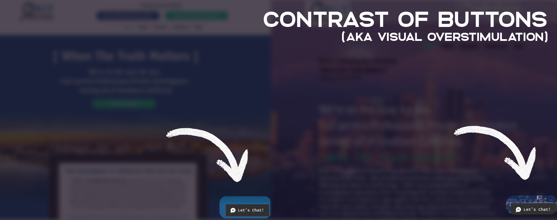
One of the best pieces of advice I can give a business owner when considering whether design or SEO is more important is to do the "Zoom Out Test". When taking a look at their site, I ask them to do so by zooming out on their website or physically getting up and walking further away from the computer.
When you try this on your website - how does it look? I've tried to replicate that with the after and before image above of a client's website. At a quick glance, which one is clearer? Which one guides your eye? Which one breaks down sections for you? And more importantly, which one would you trust more with your business at first glance?
These two images above provide 5 very simple and effective design and marketing methods to create a website design that is effective vs. solely a delivery of information. Let's take a look at some of the minor changes that give this client's site a dramatically different look.
The Clear Statement
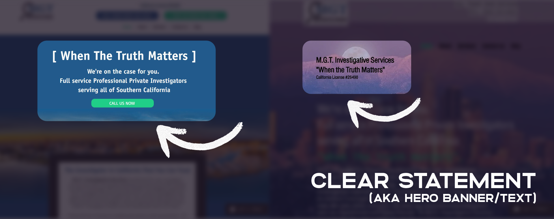
When someone visits your website, the odds are that their eyes are going to start at the top and read left to right. Additionally, when a reader tries to read content on your website, the easier it is to read, the faster they'll be able to consume your website's content and make a decision on whether your products or services are the right fit for them.
Using that as a guide, you can see that we've modified the background color and the color of the text at the top of the website (this area of a website is also called a Hero Banner if you need to do more googling). By changing the color of the text to white and also changing the area behind the text that needs to be read into a blue color, this allows the reader to clearly see the text.
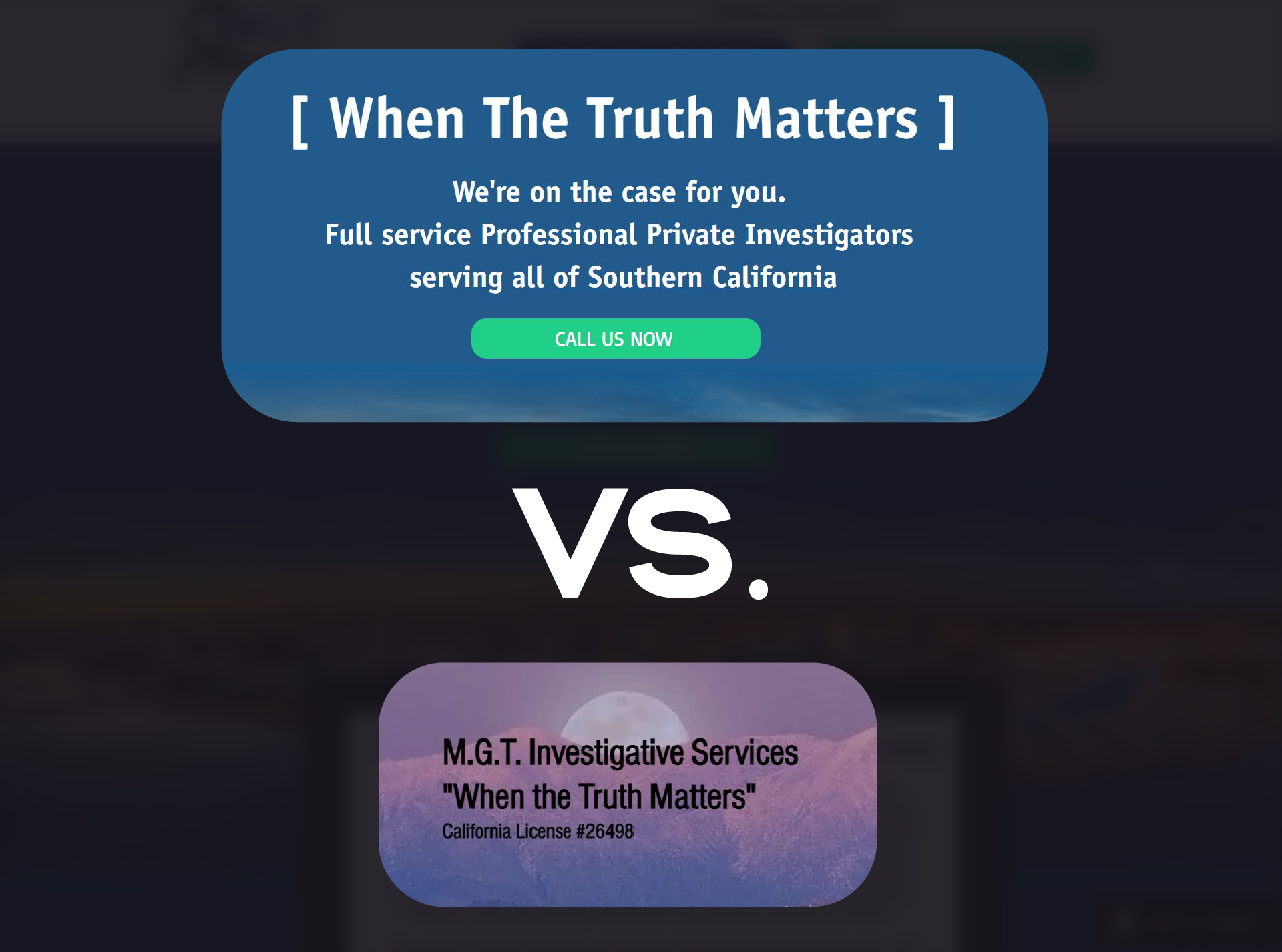
We've also separated the main "catchy title" from the description of the company so that the content doesn't get lost as a wall of text. And finally, we've added a "Call to Action" button to allow the user to be taken directly to the contact page so that they don't waste time scrolling. No one wants to waste time trying to scroll around to figure out how to contact you... they'd rather just close the window and find someone else. Brutal? Yep. True? Also yep.
Easy Contact Options
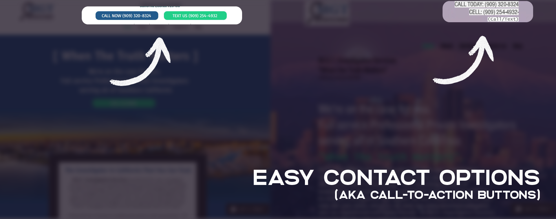
When someone visits your website, you'll want them to be able to contact you easily. That means if they can visit your site and get to your contact page, call you, text you, or message you in 1 tap - then you're a step ahead of most other websites.
If you take a look at the example above, you'll find two things - 1) The phone numbers on the original design are hard to read. 2) The phone numbers on the original design aren't clickable. This means that not only does the visitor on the site struggle to read the number, but they also have to copy and paste that number or keep swapping between screens (if on mobile) to slowly type the number into their phone to call. Again, we find ourselves running into a time problem - in these cases, you are essentially wasting your prospective client's time and they'll more happily see themselves out of your website.
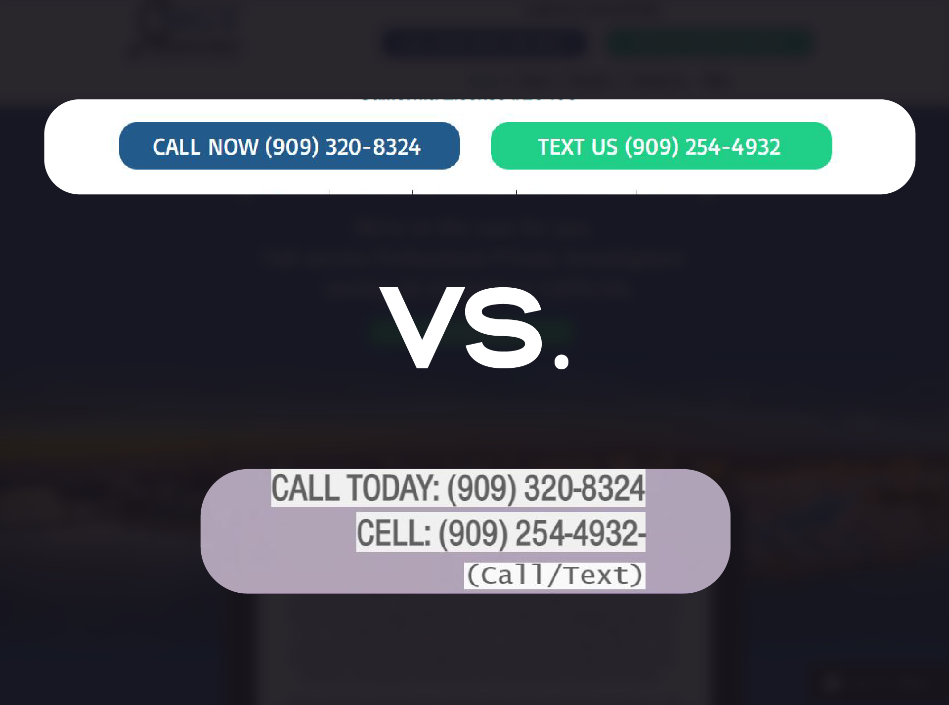
The fix is to simply add call-to-action buttons in place of typing out phone numbers or contact numbers (or even emails). If your web designer is savvy enough, they can even make a tap to text button that allows someone to text you immediately - one of our team's favorite marketing tools to use on client sites.
And lastly - the new design is cleaner and modern. Websites tend to build more trust when the design follows modern design standards and provides easy methods of communication.
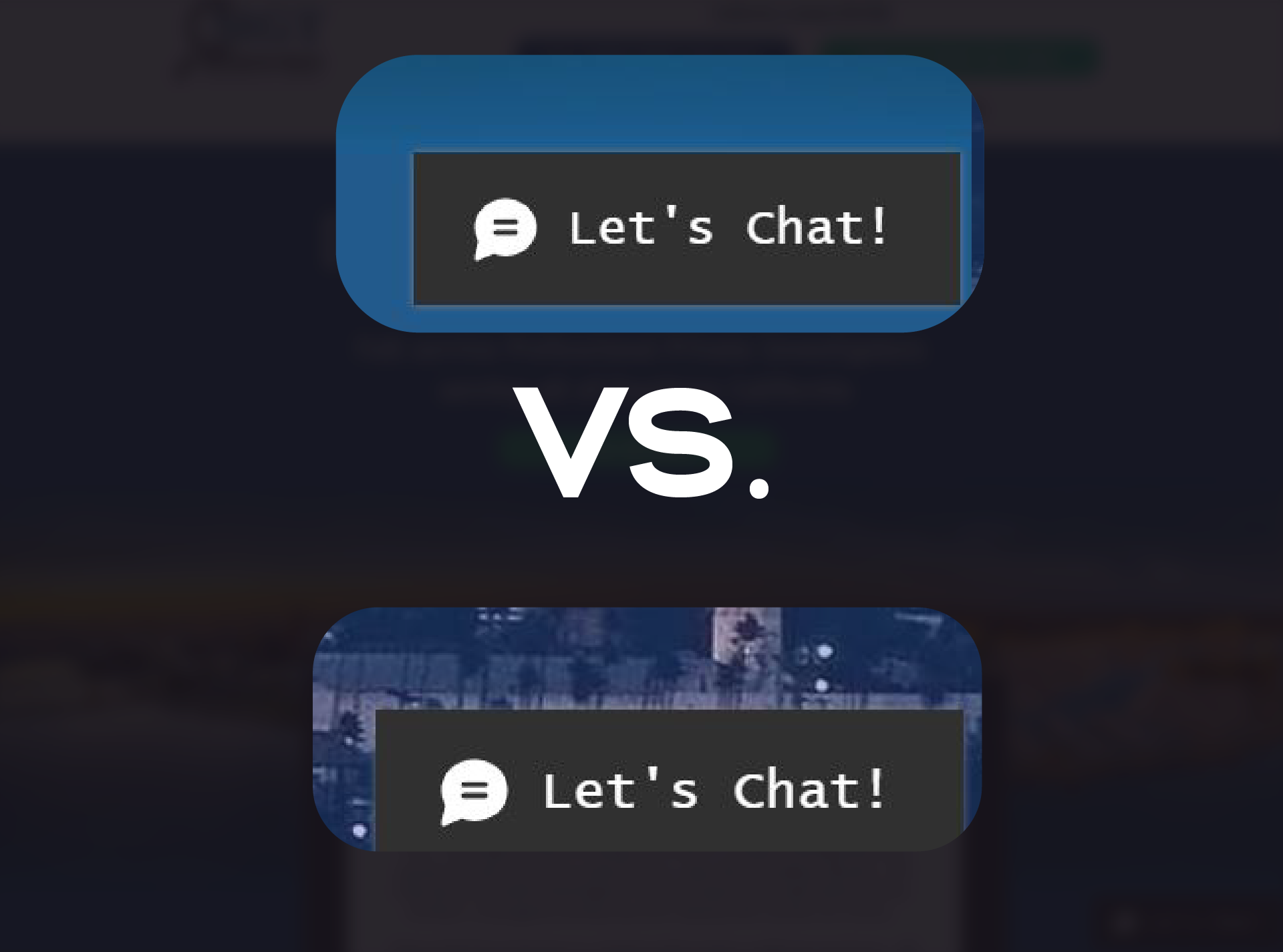
Floating Button Contrast
This one is a little trickier, but a pretty common mistake - when you have a floating button on your website, whether it be a chat button or a click-to-call button, you want to make sure that it's easy to find as soon as a website visitor lands on the page.
In the example above, you'll find that even at a distance, it's really hard to see the "Let's Chat" button in the previous design. To fix this, make sure that on every page of your site that your floating button contrasts clearly against the background when you first view the site. That's the button waving hello so that the visitor knows it's there! We want it to be intentional and noticeable - not for the visitor to say, "Oh, I didn't see that!"
Clean Logo in the Header
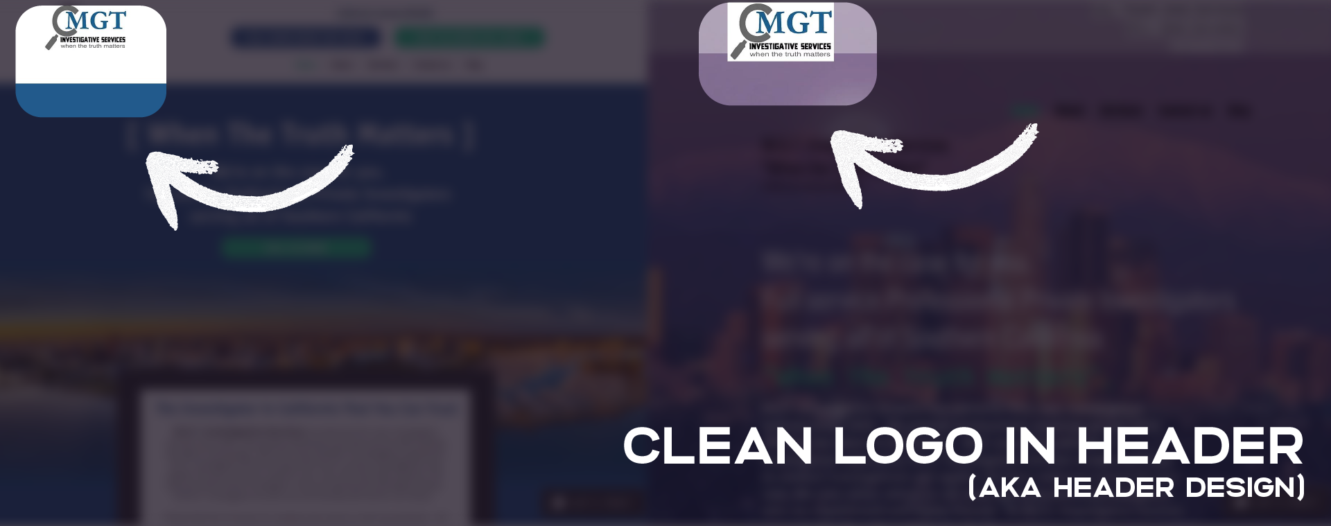
This is another very simple but also very common mistake we see. Your logo design is the centerpiece of your brand, but it also needs to play nice with the design of your site and provide a clean transition into the rest of the functionality and messaging of your website's content.
Make sure that your logo is easy to read and that the background of the logo is consistent with the color directly behind it. This helps keep the header design balanced and purposeful so that it supports the rest of the site instead of becoming a focal point that fights with the rest of your website design for attention.
Structured & Intentional Images
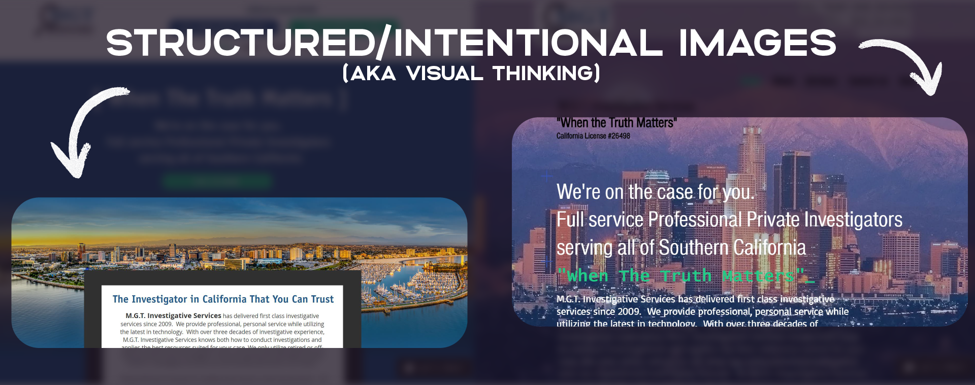
This is actually one of the #1 offenders that may be killing conversion on your website. You'll be able to easily see how much harder it is to read the text in the example on the right than on the left. Using some of the principles from the very first part of this post, we want to make sure that the text is easy to read.
Background images and images in general throughout a website are important, yet also provide ample opportunities to create a mess where it could be a strong statement piece instead. In the example above, we swapped out an image of Southern California that better conveyed something truly expansive while also separating it from the text above and below.
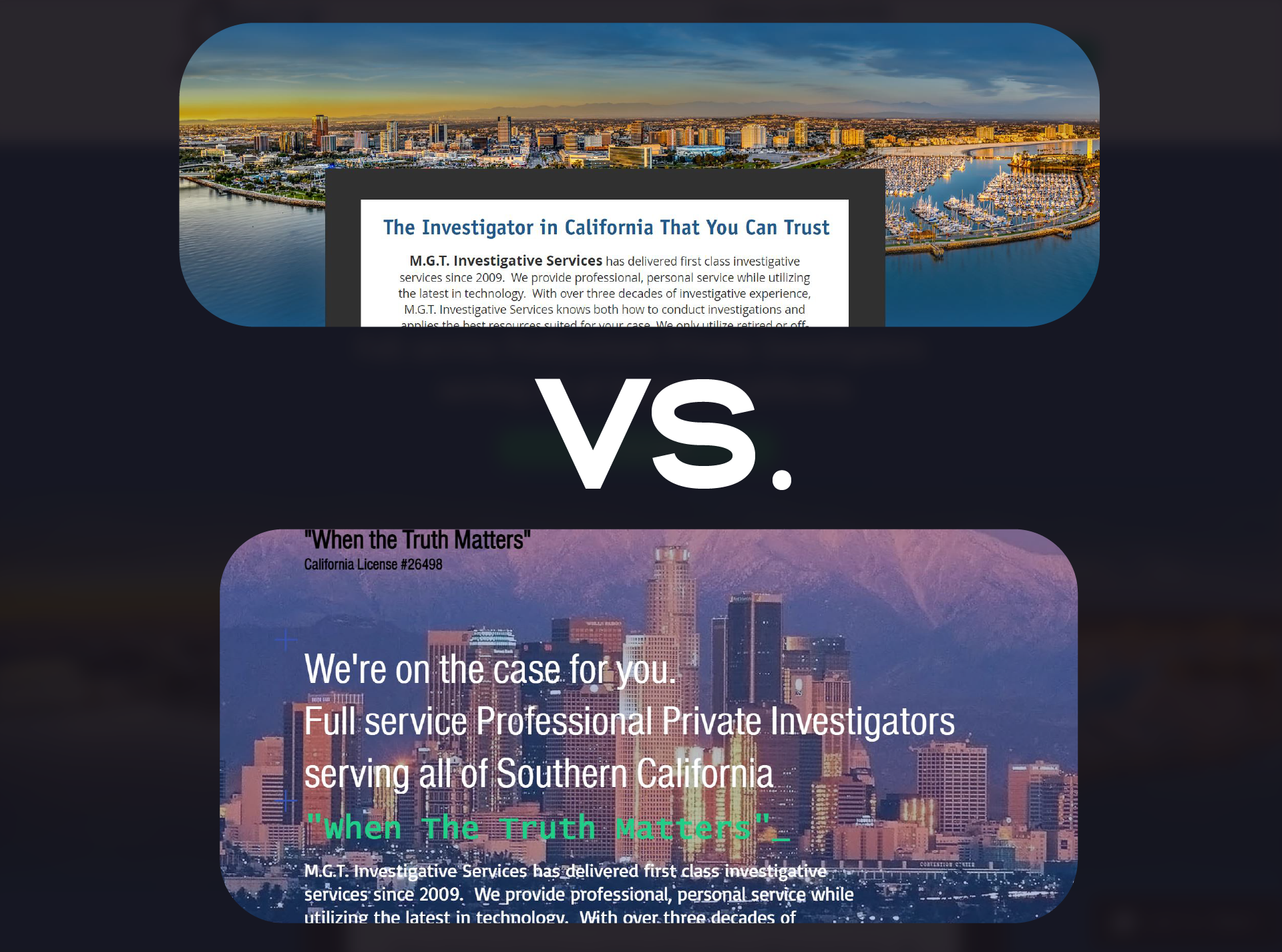
In this example, we've given the website visitor the opportunity to easily read the information as soon as they visit the site yet also take in visually that this service is also provided across a city in Southern California. The image gives a wonderful focal point and also gives a clear path for the eyes to continue traveling down the page to the next section.
If you have a lot of images on your site, there may be more opportunities for a redesign that can give images more intentional placement and provide styling that elevates the design and builds the trust of the customer.
If you're just starting with a new website or have built one and are having issues with conversion, make sure you check the design before you move forward with SEO. Website design should be a priority for any business owner to make sure that the look and feel conveys what you're selling and takes into account what a user is looking for and the experience they are having on your website. At the end of the day, it's the user who will be buying from you and it's always in your best interest to wow them with how much your website caters to them.
Looking for a quick quote for a refresh? Check out our Wix and Wordpress easy-to-use website redesign calculator below anytime and feel free to schedule a call to chat with us (did you notice we used the same advice we gave you here with our floating call to action button?)!


Member discussion