


One of the top questions our agency gets asked when it comes to a web redesign or SEO is, "How do I get more traffic to my site?" followed by, "Why aren't customers taking action on my site?"
The answer often lies in the deceptively smaller details—like the fonts you choose.
Hey, no judgment. For many businesses, this becomes an eye-opening learning experience because, at first glance, fonts might seem minor in the marketing strategy for some, but don’t be fooled—they’re not just that cute script from the dropdown on a site editor or that chunky font you may have spent an hour filtering through to find on that random free fonts website.
That's right. I know things. 👀
The perfectly curated set of fonts can significantly boost your brand’s visibility, readability, and overall appeal. The wrong ones? Quite the opposite.
Why Fonts Matter
You might be surprised to learn that 47% of consumers consider a website's readability a critical factor in deciding whether to make a purchase.
If users can’t read the text on your site, the odds of them making a purchase or clicking on that call-to-action drop significantly.
Considering that users spend an average of just 10-20 seconds on a site before deciding whether to stay or leave, making sure that your website features clear and readable text isn't something to ignore.
According to the Nielsen Norman Group, the first 10 seconds of a visitor's page visit are critical for a user's decision to stay or leave.
Sure, there are a myriad of other website best practices, but readability should be your #1 focus.
Because if visitors can't get past the first step of reading your site, all other best practices won't have a fighting chance.

The Power of Typography
Fonts aren’t just about branding; they play an instrumental role in how your audience perceives and interacts with your brand. The right font selections for your brand can enhance readability, build trust, and drive conversions.
Conversely, poor font choices can turn potential customers away.
So how can you ensure your typography isn’t holding your business back?
For those of you who foresee yourselves rummaging through font sites in the future, I'm at least going to send you away armed with enough tools to navigate your choices with more clarity for your brand to start. And maybe a new font favorite.
And for those with fonts selected for your brand, now is a perfect time to take a second look at your marketing assets (website, email designs, social media, etc.) and ask yourself several important questions to ensure this integral part of your brand identity is implemented properly.
Because it might need some tweaking.
A Look at Different Font Types: Serif, Sans-Serif, Script, and Display
First, let’s examine Serif fonts like Prata Regular.
Serif fonts are the classic, dependable choice, known for their small "feet" and "tails" that give them a traditional, formal look.

They’re ideal for print and lengthy text because they guide the eye smoothly along the lines of text.
You can think of them as the classic suit or classy red dress in a wardrobe—timeless but not always the most fitting for a hip, casual hangout.
They can also appear a bit dated or cluttered on screens, especially in smaller sizes. Pro tip? Pay attention to your serif font in multiple sizes to ensure readability. If it's too hard to read in smaller sizes, it may be wise to choose a different option.
If you're using a serif font like this one on your website or any other of your marketing materials, go ahead and take a look at it and ask - is this legible by my target market? Ask this question at all sizes that you're using.
When I say "by my target market," I mean - if your customers include readers 65+ and your sans-serif font is so tiny and squished together that it isn't legible to them...
Something is wrong. You may try increasing the size, and if that doesn't work, it may be time for a font change.
Next, we have Sans-Serif fonts like Avenir Medium.
These fonts are clean, modern, and straightforward, much like a sleek, contemporary art design.
I'm a real sucker for sans-serifs. Crisp.

Sans-serifs lack those extra strokes, making them easily read on digital screens. They’re excellent for modern websites and digital media.
Plus, it's been shown that emails with a sans-serif font have a higher open rate than serif fonts.
That said, they can sometimes lack the sophistication and character of Serif fonts.
Imagine them as the streamlined gadget in your tech collection—efficient and up-to-date, though possibly lacking in personal flair.
Script fonts, such as Greatly Clean, are an elegant and sometimes boisterous choice.
They add a touch of creativity and personal style, making them ideal for special invitations or high-end branding.
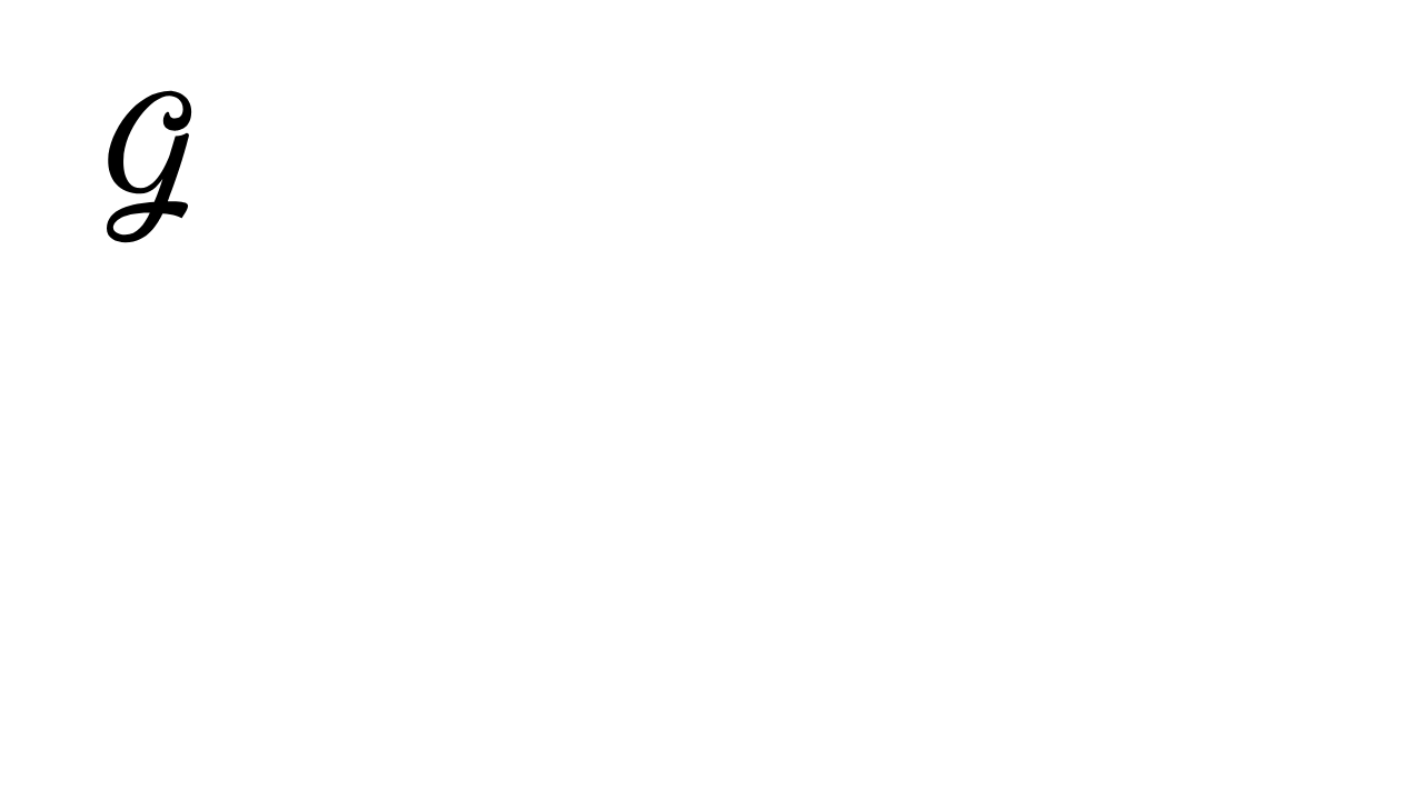
However, their intricate designs and the more exuberant styles can sometimes cause readability issues, especially for longer sentences.
Use them with care, as they are like adding a unique piece of art to a minimalist space—striking but best used sparingly.
Please run as many legibility tests as possible at all times with this one.
If you use this style of font anywhere with your brand right now, just... double-check that it's readable by your target market—not just you.
Finally, Display fonts like Artnoova Bold are bold statement-makers that are the perfect fit for headlines or promotions.
They grab attention and make a strong impact, like a striking piece of architecture in a cityscape.
Looking at you, Reunion Tower.
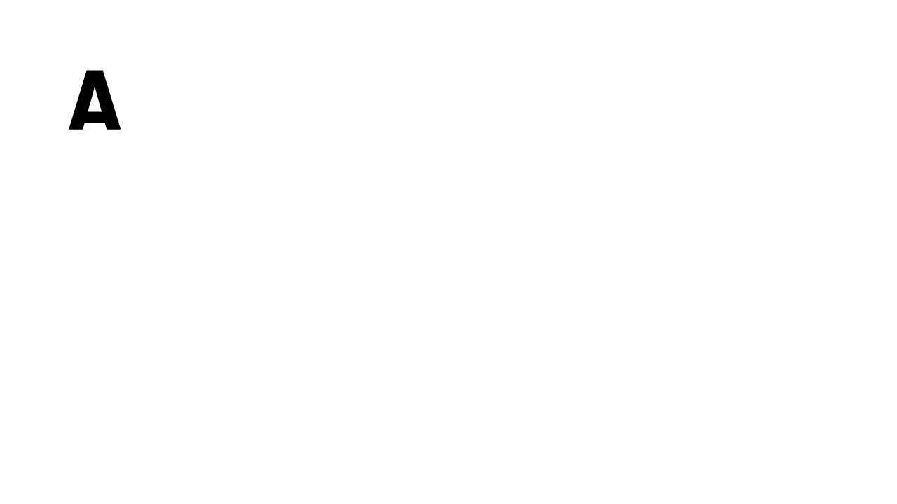
They can, however, overwhelm a reader, a website, and any advertising piece, and if overused, they can potentially overshadow your message and the entire work.
Display fonts, while punchy and great for making a lasting and memorable impression, should be balanced with readability.
And finally, as a Public Service Announcement (though yes, maybe it could qualify as an emergency in some cases), they're not meant for paragraph text or body copy (repeat, they're not meant for paragraph text or body copy).
Let Your Target Audience (and Purpose) Guide You
Ultimately, selecting the final fonts for your brand comes down to you.
While I touched on this earlier, informing those selections with your target audience and the purpose of your design, however, is a surefire way to strategically make sure your fonts are not just stylish but also resonate with your audience and enhance your brand's message.
Your font selections should reflect their expectations and preferences, and they should be consistent across each marketing piece they touch, be it social media, e-mail design, the website, or a flyer. Why?
Marketers report a 30% increase in consumer engagement when using brand-consistent fonts.
And higher engagement can have a huge impact - it can enhance brand loyalty, increase time on your website, lower bounce rates, produce higher form submissions, and so much more.
The Nuances of Typography: Online vs. Offline
Choosing the right font goes beyond aesthetics. There are nuances in font selection for online and offline use.
Experienced graphic designers with marketing expertise understand these nuances to ensure fonts are both visually appealing and functionally effective.
It’s about finding the right balance between form, function, and achieving business goals.
In addition to the impact of the design on a website, fonts need to be legible across various screen sizes and resolutions. This means ensuring that the font remains readable and effective on everything from smartphones to desktop monitors and all sizes in between.
In print, the choice of font affects how your message is perceived and interacted with on paper, where the quality and texture of the print can also impact the overall experience.
When I ran my own print shop for a few years, there was strong attention to detail, not only in the weights and coatings of the paper but also in how the graphics from our designers were expressed through the paper.
For example, the next time you get an ad in the mail, try to remember which ones you threw away or didn't open and why. Fonts play a larger role in print than you might imagine, and that's where graphic designers and marketing professionals come into play.
For the business, the font must be able to achieve the business goals for the final marketing piece and, in most cases, take a holistic view of the brand and marketing campaign as a whole, be it an e-mail design, a video edit, an ad, a flyer, a brand guide, or a web design. And remember, at most, you should have 2-3 fonts total for your brand.
Fonts and the Bigger Picture
Typography is a core element of your brand identity.
And, as you’ve seen, choosing the right fonts is more than just a design decision—it’s a strategic one that can influence customer perception and engagement.
Fonts are a fundamental part of your brand’s visual language.
At the same time, and less poetically, they can make or break your business goals on a daily basis.
The goal is to strike the perfect balance between captivating your audience and maintaining readability.
Always keep that in mind so that your font selections can indeed be in the strategic toolkit for getting you more business.
After all, if your potential customers can’t read about your brand in a style that they can relate to, how will they be able to truly connect with you?
Connect and Captivate with Fonts–Get The Font Finder
Use our user-friendly guide to find the right font for your needs. Whether enhancing your brand’s identity, designing an engaging website, or creating standout social media content, The Font Finder simplifies your font selection process with a balanced mix of high-quality free and premium fonts to suit any budget or project requirement.
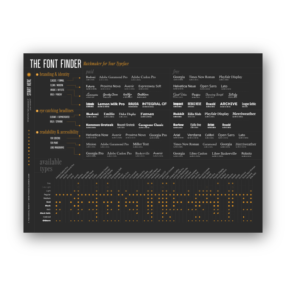
The Font Finder (Digital Download)
Are you a graphic designer, business owner, or web designer seeking the ideal font to elevate your projects? The Font Finder is your ultimate resource, meticulously crafted with expert recommendations to streamline your font selection process and enhance your branding, marketing, and design efforts.
Includes navigation through Serif Fonts, Sans-Serif Fonts, Script Fonts & Display Fonts and a detailed font list of each font's available weights and styles so that you don't have to hunt anything down.
Also available as a Poster and Large Desk Mat.
Member discussion